Payments — Payments App Suite ©2026

BOX
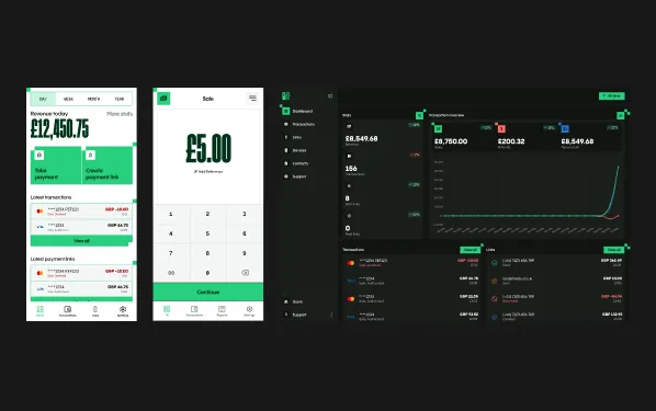
BOX lets businesses take card payments on a terminal or their phone, then track every sale on mobile and web. I was the only designer, so I did all of it, from the logo to the last success screen. I also built the payments app myself.
The Challenge
BOX was a brand-new product, built from the ground up. No old app to fix, no existing users to ask. Just a colour palette, a brand I'd already made, and three products that all had to work together.
Three kinds of people use it, often at the same time:
- Customers, who only touch the terminal to tip and pay
- Merchants, who take payments on the terminal or their phone and track everything on mobile and web
- Our own team, who set up partners and merchants and help them when something goes wrong
Each one needs something different, and a payment has to make sense to all three.
V1, getting it out
I started with the payments app, built exclusively for the PAX A920 terminal using POSitive to take payments. I did some research and looked at what other apps were doing, then worked out every screen and flow in Figma.
I wasn't completely happy with my first design style, so I kept iterating until I found one I was happy with. Then, with minimal time and nobody else to hand the design to, I went into development early. I'd only redesigned a couple of screens in the new style, but that was fine. I knew exactly what I needed to make, so the rest of the design could happen in code.
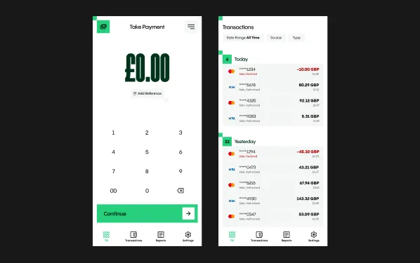
V1 let merchants make sales, refunds, preauths, completions and reversals. They could see their transactions, batch the terminal with a Z report or check the day's totals with an X report, and turn features like tipping and splits on or off in settings. Transactions are stored on the device as well as on the server, so the app works offline.
Testing with the team caught one real problem. Splits tried to divide amounts exactly, even when there was an extra 1p, which meant the merchant would have lost a penny. I fixed that before launch, and splits now always add up.
What I fixed after launch
Once people were actually using BOX, some things that made sense on paper didn't hold up. These are the biggest ones, platform by platform.
Card terminal
Bottom sheets to full screens. I'd used bottom sheets for almost everything, thinking it would be quicker than going from screen to screen. It turns out I was wrong. They were slow on the terminal and not clear enough for success and error states. The quickest fix would have been to remove the animation, but I went further and rebuilt most of the flows as full screens. That gave me the space to cut more friction and look at the app as a whole.
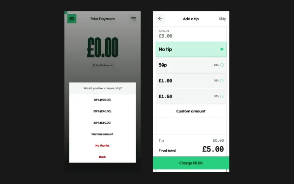
A tip screen customers can change their mind on. The old tip screen sent the customer straight to payment as soon as they tapped an option. If they changed their mind, the merchant would have to cancel the payment and hand the terminal over again. Now customers can go through the options, see how each one changes what they're paying, and confirm when they're ready.
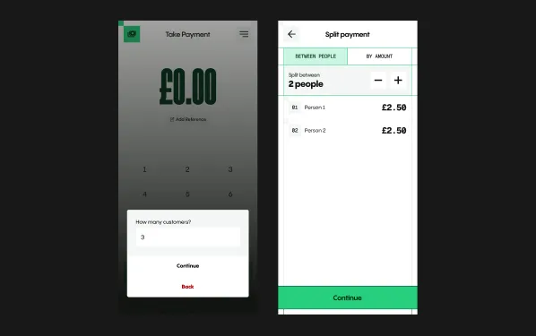
Splits without the keyboard. Splitting between people used to start with a bottom sheet asking how many people, with an input that opened the native keyboard. The sheet was slow as it was, and the keyboard made it even worse. Now it's a screen with simple + and – buttons and a list showing what each person pays. Split by amount moved onto screens too, reusing the till screen, so there's no keyboard to fight with.
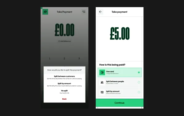
One clear choice at the till. Choosing how to pay used to happen in a bottom sheet. It's now a screen with three options (pay on one card, split between people, split by amount), followed by tip and then payment.
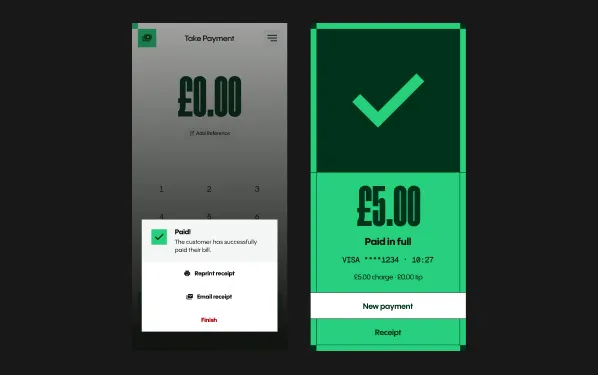
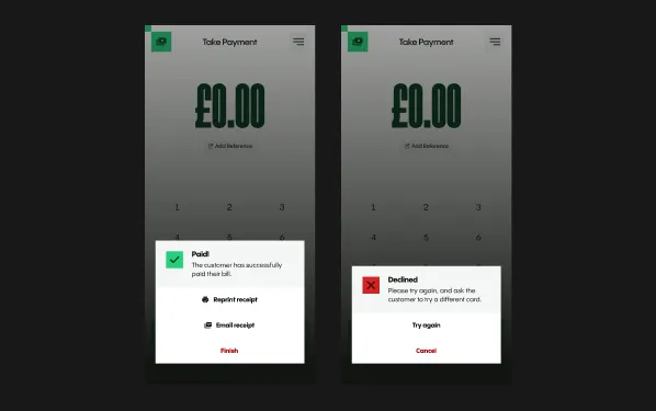
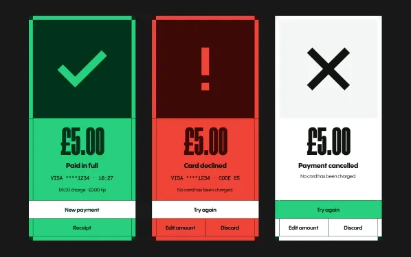
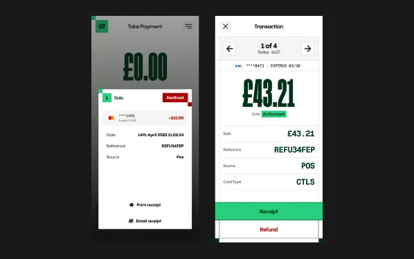
Results you can read at a glance. Approved and declined used to appear in a bottom sheet, and a cancelled payment didn't show anything at all. Now each one is a full screen in green, red or neutral, with the next steps the merchant is most likely to need.
Transactions you can step through. Each transaction used to open in a sheet you had to close before opening the next. Now it's a full screen with clearer information and buttons to move through your transactions without going back. The transactions list shows which payments were split, and each section has a small summary of revenue and authorisations. Reports work the same way, based on Z reports.
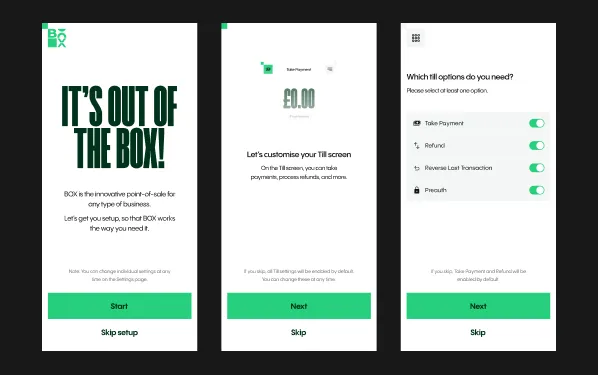
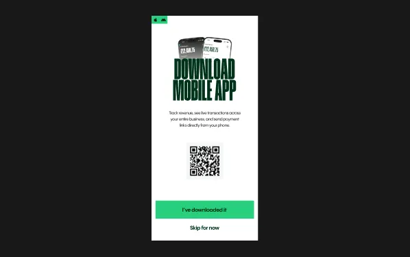
An onboarding flow, because nobody opens settings. Most merchants never go into settings, and probably don't know they can change anything. So I added onboarding that asks whether they want dark mode, tipping, split payments and so on. They get only the features they need from day one. It also tells them about the mobile app, with a QR code that takes them straight to the right app store.
Mobile app
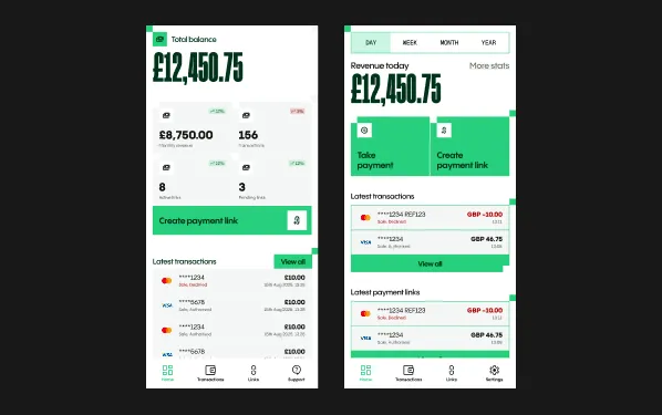
Another member of the team built the first version. I worked out the structure in Figma, then redesigned it and added a few things, like quick date range buttons (yesterday, this week, this month) on the dashboard.
A dashboard ready for more than one action. The original dashboard was built around one action, creating a payment link, with stats directly on the screen. When we added Softpay so merchants could take payments on their Android phone, that layout didn't work any more. I moved the stats to their own screen, kept only today's revenue on the dashboard with tabs for week, month and year, and put the actions directly underneath.
Web app
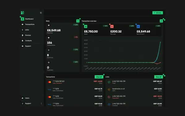
The web app covers the same ground as mobile, plus a virtual terminal and business stats. I designed both the merchant side and the admin side.
Admin tools that save our team time. Admins add partners and merchants and manage tax, currency, acquirers, hardware providers and users. I added search and alphabetical grouping so nobody spends ages looking for the merchant they need. Admins can also log straight into a merchant's account when someone calls with a problem, which helps the devs too.
What I'd do differently
If I had the time, I would have invested it in a design system at the start. The design is still shared properly across all three apps, and they clearly belong together. But if I did it again, that’s where I would start.
I'd also get all the functionality working before putting the design on top. On BOX I did both at the same time, on my own, without all the time in the world to make sure it was done properly.
Results
- 33% faster to take a payment with the new flow, tested against the old one
- Splits always add up, so merchants never lose the odd penny
- Every new merchant hears about the mobile app during onboarding
- A mobile dashboard that could grow when Softpay arrived

