Brand design agency — Marketing Website ©2026

Highful Minds
Highful Minds is a brand design agency run by Frankie, who'd spent years looking for a designer whose process he could actually trust. He found me through Instagram and YouTube and watched how I worked before he ever sent a message. By the time we spoke, he already knew what he wanted.
The problem
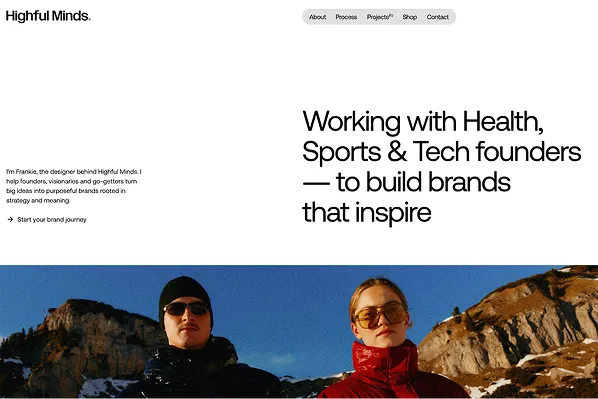
The old site didn't make it clear what Highful Minds did, how they worked or why a client should pick them. That was costing Frankie business.
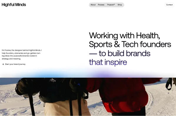
The brief was to lead with services and process and give potential clients enough to feel confident getting in touch. A shop and a newsletter were secondary goals.
Who uses it
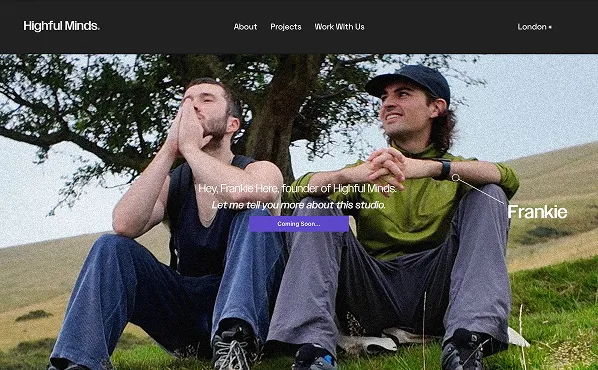
The main audience is potential clients deciding whether to trust Highful Minds with their brand. Shop and newsletter visitors come second.
Then there's Frankie, who needs to add and update project pages himself without breaking anything.
Key decisions
Direction before design
Before any design work, I asked Frankie for three competitor sites, four unrelated visual references and three things he actively disliked. Then we had a call just to go through his answers. It meant the design had real direction from the start, with no guessing.
Type that feels approachable
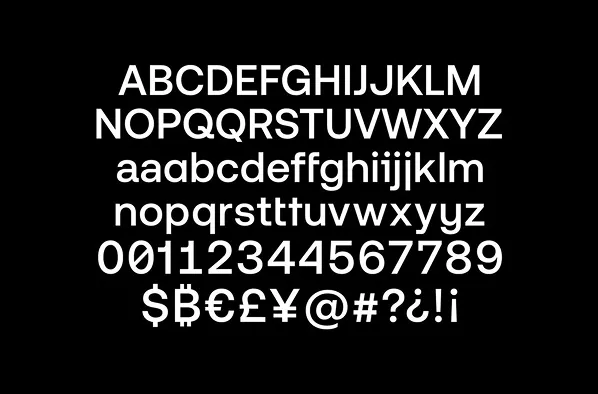
I set the typography early. Aeonik, chosen for its circular dots and the friendlier feel they give the letterforms. It suited a studio that wanted to feel approachable as well as credible.
Gradients in the details
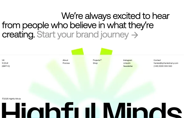
The colour is mostly black and white with bursts of gradient. Through iteration, the gradients moved out of the hero background and into animated section dividers and buttons, which felt more considered and a lot less heavy.
Pushing back on the shop
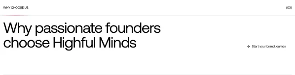
Frankie wanted the shop near the top of the homepage. I pushed back, because putting it there would have broken up the client-focused copy, and that copy was the main job of the site. We worked through it together and found a spot that didn't compromise either.
A CMS he can't break
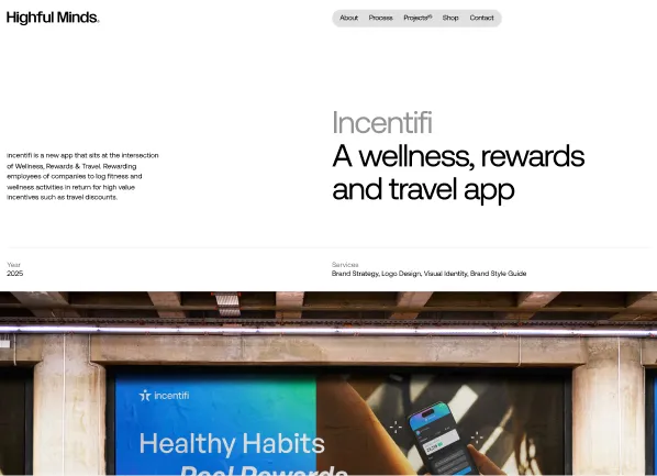
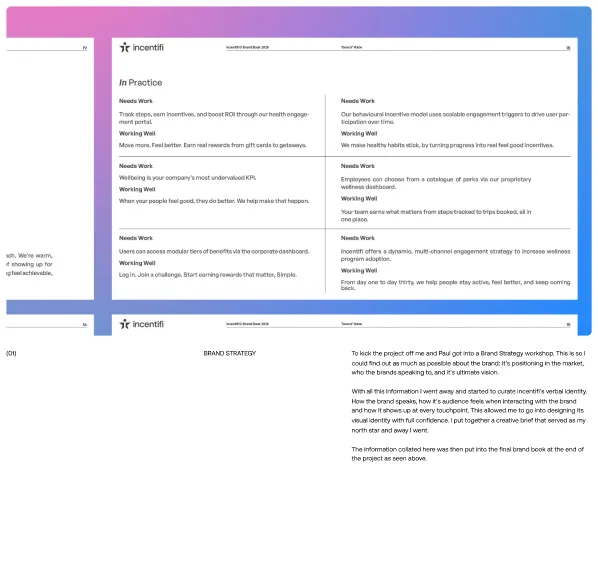
I set the CMS up with a custom block system, with full-width, two-column, text and video blocks, all reorderable. Frankie can build project pages in any layout without touching the structure.
Result
Highful Minds launched with a site that finally matches the standard of Frankie's work. It's clear what the studio does, how it works and who it's for, which was the whole point. The shop and newsletter sit on top without pulling focus from getting clients in touch.
“It's hard to articulate how fantastic my experience was working with Lee. He brought my vision to life. He just got it. It's the best experience I've had working with someone. And it was nice to be on the other end of the creative process. If you're looking to get real results for your business, look no further.”

Frankie Harry
Founder of Highful Minds

